001 HEALTH SERVICE
Redesigning a critical CRM for 300 healthcare employees
UX DESIGN LEAD | UX STRATEGY
FIGMA, MURAL, DYNAMICS 365
JANUARY 2020 - JULY 2021 (1.5 YEARS)
PUBLIC SECTOR
01/ Overview
TIMELINE
The project had been running for five years when I joined the team. I stayed for 1.5 years, leading the UX work throughout the redesign.
TEAM & LANGUAGE
The cross-functional team included 10 developers, 6 business analysts, 5 testers, 1 Product Owner and 1 Proxy Product Owner, working across Germany and Austria.
I was the UX Design Lead, embedded within the Business Analysis team and working closely with product, business and development stakeholders.
The working language was German.
PROBLEM STATEMENT
The application was a custom CRM used by healthcare service employees to manage complex client cases.
Over time, the system had accumulated outdated features, fragmented workflows and significant usability issues. These became particularly critical during the pandemic, when the volume of requests increased and employees needed to access information quickly and reliably.
The CRM was also built on on-premises technology that was approaching end-of-life, making a complete redesign necessary.
02/ PROBLEM & CONTEXT
USERS
The application was used by 300 healthcare service employees across Austria, from front-office agents to agency managers.
Users were aged 24–59 and spent approximately 7 hours a day working in the CRM.
BUSINESS IMPACT
The business impact was twofold: Firstly, the cognitive load associated with using the application was very high, because no UX work was done when developing. It collected data and served as a portal to four other management applications (finance, accounts, history, etc.). Secondly, the on-premises technology used is due to be discontinued, and an upgrade was required.
03/ RESEARCH & INSIGHTS
KEY RESEARCH METHODS
User interviews & contextual inquiry
I conducted 20+ one-on-one interviews and contextual inquiries to understand how employees actually used the CRM in their daily work.
Rather than focusing only on reported pain points, I looked at behaviours, workarounds, decision-making and the context in which users needed to retrieve and act on information.
Card sorting & usability testing
I used card sorting to explore a more meaningful information architecture and A/B testing on high-fidelity designs to compare potential solutions.
Because users found it difficult to imagine how a new experience would work from wireframes alone, testing more realistic interfaces was particularly valuable.
CRITICAL FINDINGS
Lack of autonomy and confidence
Users often did not trust the system enough to feel confident when performing an action.
For complex processes, they lacked visibility into what had already happened, what was currently happening and what they needed to do next.
The issue was therefore not simply usability — it was a lack of control and confidence in the system.
Visual identity & resistance to change
The interface looked outdated and no longer aligned with current design standards.
However, users also perceived the existing system as robust and familiar. A redesign that looked significantly different risked creating more resistance rather than improving the experience.
The challenge was to modernise without breaking the familiarity users relied on.
Missing Information Architecture
The existing information architecture made it difficult to find the right information at the right moment.
Users had to navigate through multiple areas of the application — and often other applications — to understand the status of a client case.
This created unnecessary cognitive effort and slowed down everyday tasks.
04/ DESIGN PROCESS
FROM RESEARCH TO SOLUTION
Research showed that users frequently needed to provide quick and reliable answers while speaking with clients or responding to messages.
However, they could not easily see which processes had already been started for a client, what their current status was, or whether information was missing.
This led to a clear design opportunity:
Instead of giving users more information, we needed to help them understand the right information faster.
KEY ITERATIONS
Iteration 1 : Simplifying information architecture
Initial design : The first concept brought all active client processes together in a dashboard using tables, tiles, diagrams and cards.
Testing revealed : Users found the dashboard overwhelming. Although it provided more information at a glance, it created more visual stimulation than the previous interface and was perceived as “too fancy”.
Pivot: I moved away from an information-heavy dashboard and introduced tabs organised by process category, keeping the interface deliberately clean and familiar.
Result: Time required to access information decreased from 1.5 minutes to 0.75 minutes — a 50% reduction.
Iteration 2 : Making the process visible
Initial design: Process details were displayed through a status and sub-status field. To understand the wider process, users still had to switch to another application.
Testing revealed: Users did not feel in control of the process because they could not easily understand all its steps or see what information was still missing.
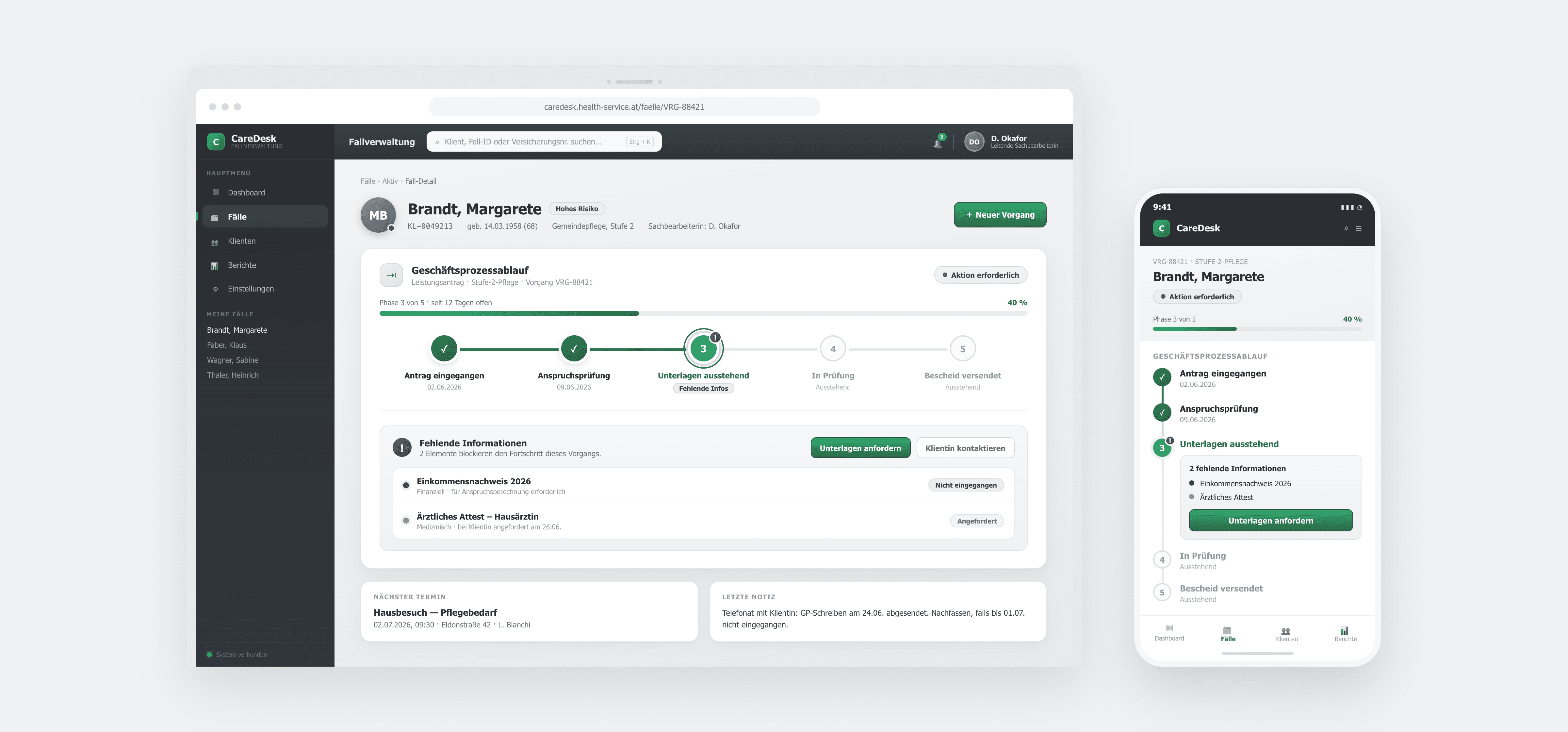
Pivot: I introduced a Business Process Flow showing active and inactive stages, the current status and the information required to move the process forward.
Result: The new flow was highly adopted, with 95% of users no longer needing to switch applications to follow a process.
DESIGN DECISIONS & RATIONALE
Clarity over information density and orientation over feature richness
User control over visual novelty
Progressive validation over assumptions
05/ SOLUTION
FINAL DESIGNS

PROBLEM SOLVED
Cognitive load
The redesigned information architecture made complex information easier to navigate and reduced the effort required to find relevant information.
By bringing key process information into a clearer structure, users could spend less time searching and more time handling client cases.
User acceptance
User acceptance was a critical part of the redesign.
Rather than focusing only on visual modernisation, the solution reinforced users' sense of autonomy, confidence and control.
The Business Process Flow gave users a clearer understanding of where a case stood and what needed to happen next, reducing uncertainty when handling complex processes.
06/ IMPACT & RESULTS
METRICS & OUTCOMES
-50%
Time taken to access information
WHAT I HAVE LEARNED
Change Management
When redesigning a mature enterprise product, usability is only one part of the challenge. Users also have habits, mental models and expectations that need to be understood and respected.
The project reinforced my belief that good UX is not about introducing the newest interface. It is about understanding the people, systems and constraints around a product — and making the right things simpler.
Working with scaled agile
I was fully embedded within a scaled Scrum environment, working closely with developers, business analysts, testers and product owners.
Because development was progressing continuously, UX needed to stay approximately 1–2 weeks ahead of implementation.
This required close day-to-day collaboration, early feasibility discussions and continuous alignment between design and development.
It also taught me how important it is for UX to be involved not only in defining the experience, but in making sure the design can realistically become part of the product.
These projects are presented in an anonymised format due to client confidentiality. The visuals are illustrative, while the challenges, approach and outcomes reflect the actual work.