003 GREEN ENERGY
UX DESIGN | UI DESIGN LEAD
FIGMA, MURAL, POWER APPS
01/ Overview
TIMELINE
The global project started in 2014 and is still ongoing. The self-service app project lasted 1 year until go-live.
TEAM & LANGUAGE
The team was composed of 5 developers on-shore, 6 developers offshore, 2 business analysts, 5 testers, and 1 PO, and was located in Germany, Austria, and India.
I was the UX Design lead on the project.
Languages used in the team were German and English.
PROBLEM STATEMENT
The project brought together a large and constantly changing network of contractors, engineers and construction companies. The organisation needed a reliable way to collect, validate and approve the hours worked across different projects and teams. The new self-service platform had to become a single source of truth for time reporting while remaining simple enough for users with very different roles and levels of familiarity with the system.
02/ PROBLEM & CONTEXT
USERS
The application was used by 1,000+ contractors and employees, with the user population changing continuously as new contractors joined projects.
Two main workflows emerged:
Individual contributors, submitting their own hours
Team managers, reviewing and submitting hours on behalf of their teams
These users had different responsibilities, different information needs and different expectations from the same system.
BUSINESS IMPACT
The platform supported a critical operational process: tracking hours accurately enough to support project monitoring and billing.
For the organisation, errors or incomplete submissions created additional work during approval and reporting.
For contractors, the process needed to be fast, transparent and reliable — particularly because timesheets were a recurring administrative task rather than the core of their job.
The product therefore had to balance operational control for the organisation with autonomy for the people entering the data.
03/ RESEARCH & INSIGHTS
KEY RESEARCH METHODS
User interviews & diary studies
I conducted 5+ one-on-one interviews to understand users' needs, behaviours and pain points.
Diary studies helped capture the experience over time, particularly around recurring timesheet submission and correction tasks.
Journey mapping & A/B testing
I mapped the end-to-end experience to understand where friction accumulated across the complete workflow — from preparing data to submitting, reviewing and getting it approved. I used A/B testing to validate key iterations and compare alternative approaches before implementation.
CRITICAL FINDINGS
Autonomy & confidence
Users needed to feel confident that their hours had been imported and processed correctly.
The submission process was repetitive and error-prone, particularly when users had to work between Excel files and the application.The key need was t herefore not simply speed, but confidence that the information was correct and under control.
Import → Submit → Follow-up → Report
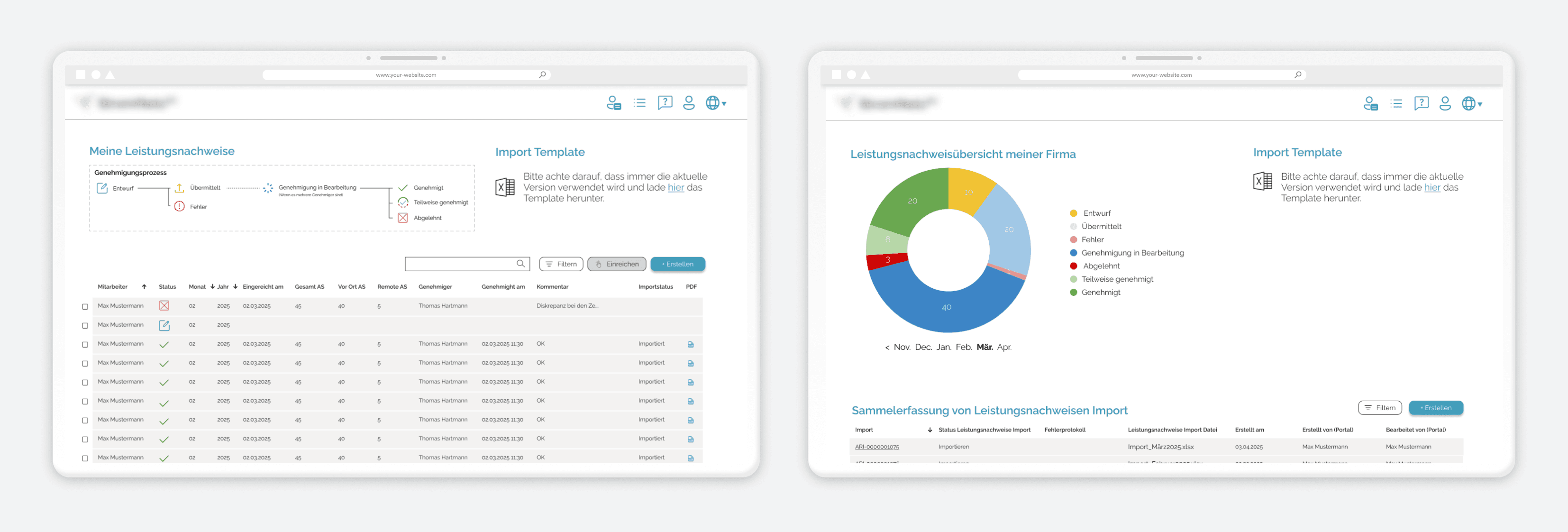
Excel was an established part of the workflow, but the transition between Excel and the application created unnecessary friction. Users needed a clearer way to understand what had been imported, what had been submitted and what still required action. This became the central flow of the product.
Approval & follow-up
Managers needed visibility into the status of timesheets and clear indications when action was required. Without a clear overview, users had to rely on manual follow-up and repeated checks.
The approval process therefore needed to become visible and actionable, rather than simply being the final step of a submission form.
04/ DESIGN PROCESS
FROM RESEARCH TO SOLUTION
The research revealed that the friction was not concentrated in a single screen or interaction.
It was created by the handoffs between people, files and systems: preparing data in Excel, importing it, checking it, correcting errors, submitting it and following up on approval.
Rather than optimising each step independently, I mapped the end-to-end workflow and focused on making these transitions more coherent.
This led to two key design directions:
Separate the experience according to the user's responsibility. Bring critical review and correction activities into the product itself.
The objective was to make the platform not just easier to use, but more reliable as the operational source of truth.
KEY ITERATIONS
Iteration 1 : Submitting for yourself or a team
Initial design: The first concept combined individual and team submissions into a single feature and form.
The intention was to create one consistent submission experience for everyone.
Testing revealed: We identified two fundamentally different user contexts:
users submitting their own hours;
managers submitting and reviewing hours for an entire team.
Trying to accommodate both in one workflow created unnecessary complexity.
Pivot: I separated the experiences at the entry point.
After logging in, users could choose the task they needed to perform and were directed to a dedicated dashboard and workflow.
This allowed each experience to expose only the information relevant to that role.
Result: Time on task decreased by 25%, from 10.2 to 7.65 minutes.
Iteration 2 : Reviewing
Initial design: Users could only correct individual time reports by editing the original Excel file.
To make a correction, they had to delete the existing line, update the spreadsheet and upload the data again.
Testing revealed: This created unnecessary friction and increased the risk of errors.
The application was intended to become the single source of truth, but the workflow still depended on an external file for basic corrections.
Pivot: I introduced an in-app correction workflow allowing users to review and edit imported timesheets directly within the platform.
This removed the need to repeatedly delete, modify and re-upload data.
Result: I observed 62.7% fewer errors during testing.
DESIGN DECISIONS & RATIONALE
Designing around operational realities, not system structure
Making the product the source of truth & optimising for confidence, not just speed
Balancing user needs with technical constraints
05/ SOLUTION
FINAL DESIGNS

PROBLEM SOLVED
A clearer submission experience
Separating individual and team workflows reduced unnecessary information and helped users focus on the task relevant to their role.
The experience became easier to navigate while supporting both simple individual submissions and more complex team management.
A more coherent end-to-end workflow
By bringing review and corrections into the platform, users no longer had to repeatedly move between the application and Excel. The product could better fulfil its role as a single source of truth for time reporting. Clearer status information and follow-up helped users understand where timesheets stood in the approval process and when action was required.
06/ IMPACT & RESULTS
METRICS & OUTCOMES
-25%
Time on task.
WHAT I HAVE LEARNED
Designing around real-world constraints
This project reinforced that good product design does not happen in isolation from technology. Working within Power Apps meant making deliberate choices about what was worth designing, what could be reused and where technical constraints required an alternative approach. Close collaboration with developers and Power Apps specialists allowed me to validate feasibility early rather than designing solutions that could not realistically be implemented.
UX maturity is also about collaboration
I led the redesign while working closely with the Product Owner and client stakeholders throughout the project. Having a UX-aware Product Owner created a strong environment for evidence-based design decisions and made stakeholder alignment significantly more efficient. It reinforced the value of having UX involved not only in interface design, but in shaping the product conversation from research through delivery.
These projects are presented in an anonymised format due to client confidentiality. The visuals are illustrative, while the challenges, approach and outcomes reflect the actual work.